
Leo Burnett Updates Its Branding With Colourful, Modern Twist
Oct. 19, 2017
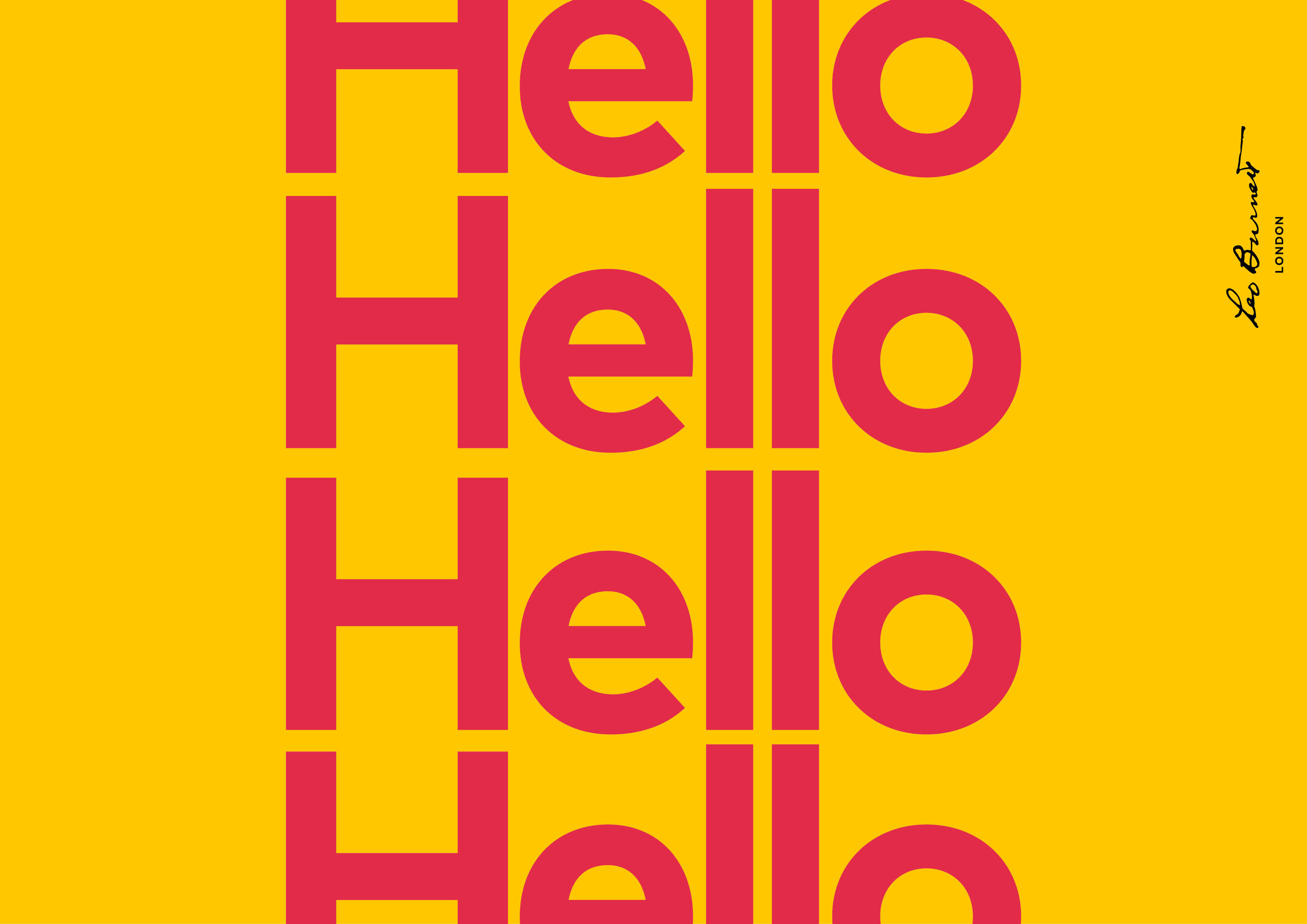
Leo Burnett has redesigned its visual identity based around the agency’s iconic signature logo with a colourful, modern twist intended to carry the agency through the 21st century … and beyond.
Leo Burnett’ s London-based design team, led by Head of Design Phil Bosher, went back to the agency’s roots to project its core values and symbols of its heritage in a modern and inviting way.
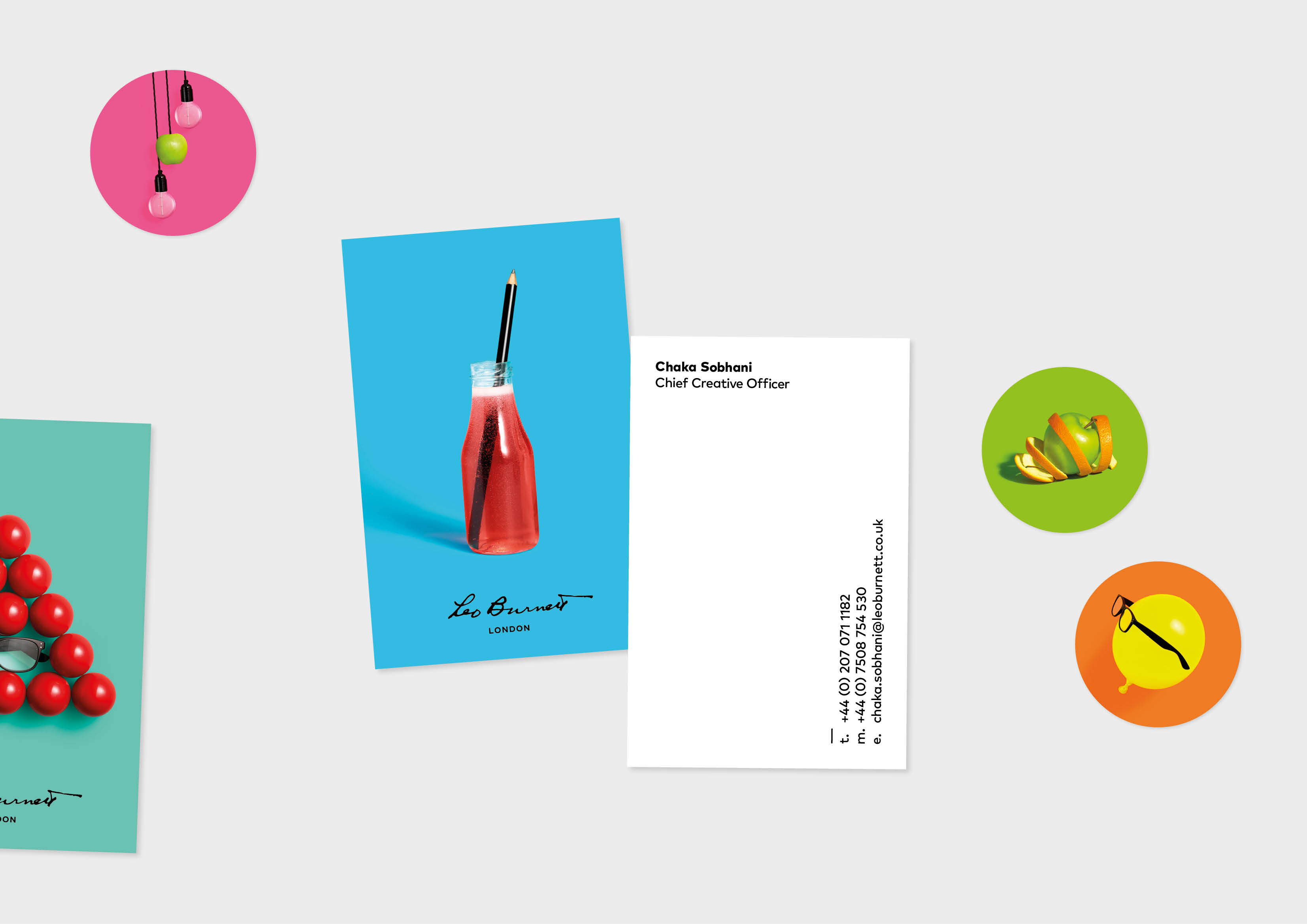
Founded in 1935 and named after its eponymous founder, the agency’s visual identity has long featured Burnett’s signature alongside company symbols such as his distinctive black glasses, big black pencils, and apples.
Burnett used big black Alpha 245 pencils throughout his career – in part inspired when, as a child, he watched shopkeeper father lay out ads for his store on the dining room table – and once commented the big ideas come from big pencils.
When starting his agency during the 1930s recession, Burnett was told by a competitor that he’d be selling apples on the street before he made money in advertising. Apples have been put in reception for staff and clients a symbol of hospitality and success ever since.
The new visual identity is a fresh and playful reinterpretation or the agency’s core brand elements and features a bold new colour palette and new typeface – FontFont’s geometric sans-serif typeface ‘Mark’.
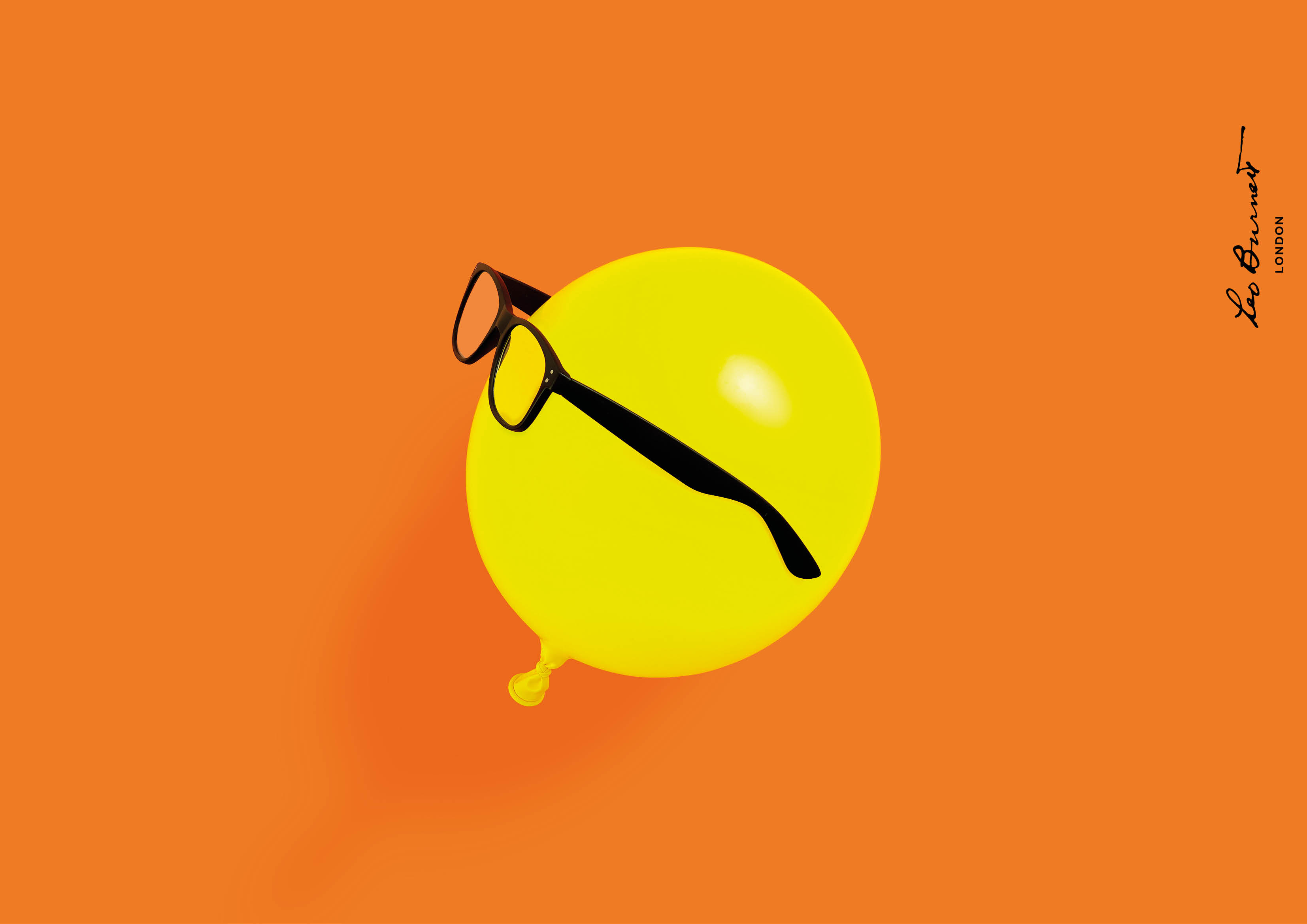
A series of colourful photographic images featuring the iconic pencil, apple and Leo’s glasses have been created to bring to life Leo Burnett’s core values. For example, in one, the distinctive black glasses worn by a yellow balloon. In another, the black pencil leaning in a bottle of drink like a straw.
Mark was chosen for its quirky friendly letterforms n as the perfect complement to the new identity’s contemporary still life photography and colour.
With its broad family of weights and italicised forms, the font is versatile and universally appealing. The result is a bold, modern and engaging visual Identity that’s both welcoming and inclusive.
The new visual identity has been rolled out in the UK via a new website and social channels.


Chaka Sobhani at Leo Burnett London said:
“At Leo Burnett we believe that solving human problems is what makes businesses grow. Put simply, we always want to turn up human and look to make stuff that people truly love.
Our new visual identity needed to reflect this agency philosophy. So we’ve created a simple but more fun, friendly and inviting look that better reflects the personality of the agency and people within it".
The launch of Leo Burnett’s new visual identity follows Leo Burnett’s expansion of its London creative department with a number of new, senior design appointments, instrumental in shaping the new look and feel.
Phil Bosher, who led the redesign of the brand identity, joined recently as Head of Design having worked as a Senior Designer at Mother, CHI & Partners and adam&eveDDB after working as a Designer at Fallon.
Other recent additions to the team include Paul Reddington, a former Senior Designer at Grey London and Adam&EveDDB, and Studio Manager Richard Pettiford. Both Reddington and Pettiford also worked on Leo Burnett’s visual identity redesign.
Related News
Postcode Lottery Turns Everyday Exercise into £5m Charity Challenge with First-of-its-Kind Strava Activation
"Crowns for Causes" rewards movement with charitable funding
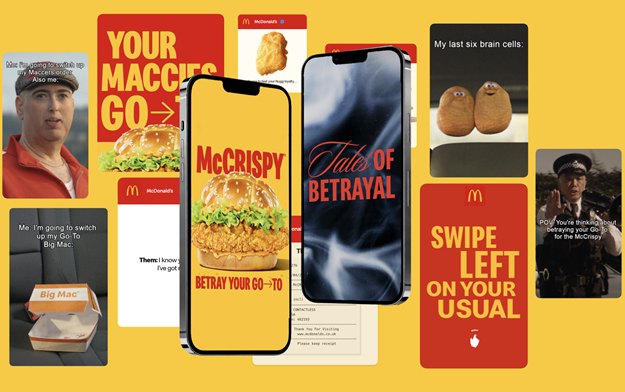
McDonald's Tempts Menu Loyalists to Betray their "go-to" Orders for the McCrispy
McDonald’s spotlights its chicken credentials in a new Leo UK campaign, urging fans to ditch their usual order for the McCrispy

Postcode Lottery Captures Real Moments Around the Win in Docu-Style Campaign
Created in collaboration with Leo UK, the campaign marks its first work for the brand and takes a documentary-style approach

Latest News

Jun. 22, 2026
Joybyte Turns Heretic Parfum's Viral Nosferatu Moment Into a Profitable TikTok Shop Engine
The collaboration began in February 2026 after Heretic’s gothic and horror-adjacent fragrance content gained traction on TikTok

Jun. 22, 2026
Majority of Brits have "Never Forgotten" Father's Day but Dads Beg to Differ
Well intentioned Brits claim to remember Father's Day, but dads tell a different story and many are spending more than their dads think they need to – new research